UX Magazine recently published the article “Should We Focus on User Experience?” where they make a strong argument for taking some of the focus off of designing the ideal user experience and refocusing on creating positive memories associated with your site. The argument being that if a user can’t recall having had a positive time on your site, the design of your site has done little to earn a second visit.
Does The Premise Hold Up?
The answer comes down to this… 1 hour after leaving your site, some memory is left with your visitor; but what about 24 hours later? Did your site do enough to inspire them to noodle you around in their heads? Enough to make it stick? If not, then a tree has fallen in the forest, but no one stuck around to hear it strike the ground. The article explains it well:
In an almost dictatorial way, our remembering self selectively picks what parts of an experience it wants to remember. And later, it makes its decisions based on those memories.
So What Makes a Site Stick?
If I’m at liberty to oversimplify: first, the site gave the visitor what they came for and second it found a way to surprise them.
The Use Case: Your Widget
Let’s boil this down to the simplest use case, you have a new widget or service that you’re trying to sell. You need a web page to promote said widget. The goal of this page is simple: to motivate every page visitor to order the product. So we need to drum up some “must-have momentum.” The trouble is your widget is complicated, or it’s so simple that I can’t see any reason why I’d choose your product over someone else’s.
This is the point at which most pages roll out a bulleted list of features… and it’s the point where most pages fail. If your copywriter is a delightful lyricist your list is going to give me the information that I was looking for. But unless you have a bullet that boasts your ability to make me 4 inches taller or teaches my dog to appreciate the fine service of the FedEx guy, there’s no chance that your page is going to surprise me—much less create a memorable experience.
Using Video To Pull It Off
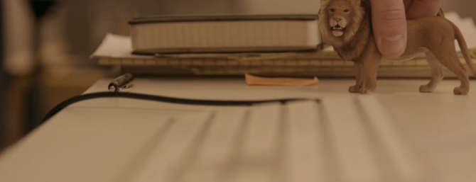
So here’s my proposition: scrap the bulleted list and drop in a video. Even an unimaginative video allows you to take that bulleted list, speak it, and provide visuals to play along with it. This is the classic explainer video. At it’s most creative, this video has the power to move your audience. I’ve seen videos about products and services that speak to a true pain point in my life—and propose to solve it. Here’s a great example from the folks at Zendesk:
Zendesk wasn’t inspired by user experience, they were inspired by the power of the “remembering self” when they created this touching, playful story. While they may count on good user experience to occasionally close the deal, it’ll be the video that creates countless easy sales.


